Design That Gets Noticed, Read, and Acted On
Three-second rule: Your headline and offer must be understandable within 3 seconds — that is how long a recipient spends deciding whether to read or discard a mail piece
Oversized outperforms: 6x9" and larger postcards generate 20-30% higher response rates than standard 4x6" cards
Personalization lift: Adding the recipient's name to the headline boosts response 10-15%; deeper personalization (neighborhood, purchase history) lifts 25-50%
Visual hierarchy matters: Eye-tracking studies show readers scan in a Z-pattern — place your headline top-left, image top-right, body copy center, and CTA bottom-right
USPS compliance is mandatory: Barcode clear zones, address placement, and minimum card thickness must meet postal standards or pieces will be returned or surcharged
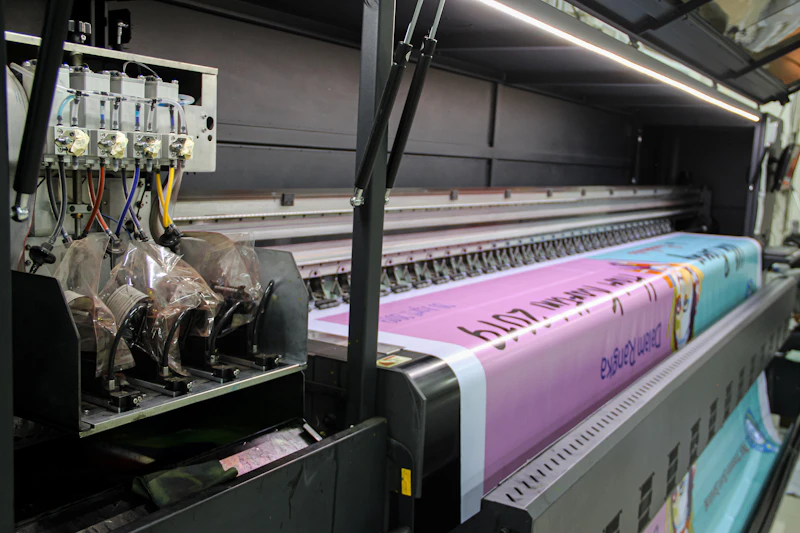
The most expensive class of design mistake is the one that survives every proof. Picture a custom-die-cut CPG mailer that looks spectacular on screen and in proof, printed on a 14pt C1S stock that wicks the water-based coating just enough that the die-cut edges fuzz on 6-8% of pieces — invisible at arm's length, ruinous under a kitchen-counter light. Ship 84,000 pieces like that and there is no second drop. The protection is procedural: test on actual press stock, not proofs, and build in time for a 500-piece live production sample before the full run. According to USPS research on mail engagement, recipients spend roughly 3 seconds sorting the mail pile — but if the piece fails at the printer it never reaches those 3 seconds.
Oversized formats, dimensional mailers (pieces with physical depth or an enclosed object), high-quality paper stock, vivid color printing, and personalized elements all increase the probability that a piece survives the initial mailbox sort. Once the piece is in the recipient's hands, the copy and layout must guide the reader's eye through the content in a logical sequence that builds interest and leads to a clear call to action. For production and fulfillment of your designs, see our best direct mail companies guide.
Design by Format: Postcards, Letters, and Self-Mailers
Each direct mail format has distinct design requirements and best practices. Choosing the right format for your campaign goals is the first design decision, and it influences everything from creative approach to postal costs and ROI.
| Format | Best For | Response Rate | Design Priority | Cost Per Piece |
|---|---|---|---|---|
| Standard postcard (4x6") | Budget awareness campaigns | 1.5-3.0% | Bold headline, single image | $0.40-$0.80 |
| Oversized postcard (6x9"+) | Offers, promotions, local marketing | 3.0-5.0% | Large imagery, clear offer | $0.60-$1.50 |
| Letter package (#10 envelope) | Financial, insurance, B2B | 3.5-7.0% | Envelope teaser, personal tone | $1.50-$3.00 |
| Self-mailer (folded) | Nonprofits, events, catalogs | 2.0-4.0% | Teaser panels, reveal interior | $0.60-$1.25 |
| Dimensional mailer (3D) | High-value B2B, luxury | 5.0-15.0% | Tactile experience, surprise | $2.00-$10.00+ |
| EDDM flat (oversized) | Local saturation campaigns | 1.0-3.0% | Universal appeal, map/location | $0.30-$0.55 |
Postcard Design
Postcards are the workhorse of direct mail — no envelope to open, instant visibility of your message, and the lowest cost per piece. The front panel should feature a single dominant image (covering at least 60% of the surface), a bold headline visible from arm's length, and your brand identity. Avoid cramming text onto the front — its job is to capture attention and create enough interest for the recipient to flip the card over.
The back panel carries the detailed offer, supporting copy, call to action, and response mechanism (phone number, URL, QR code). Include a map or address for local businesses, customer testimonials for credibility, and an expiration date for urgency. Oversized postcards (6x9" or larger) consistently outperform standard 4x6" cards because they are harder to miss in the mailbox and provide more space for your message. For EDDM campaigns, the minimum postcard size is 6.125" x 11.5".
Letter Package Design
The classic letter package — an outer envelope containing a letter, possibly a reply card, and sometimes a brochure or lift note — remains the highest-response format for many industries. The outer envelope's teaser copy is the single most important design element because it determines open rates. Effective teasers include benefit statements ("Save up to 40% on your home insurance"), questions ("Are you paying too much for...?"), urgency triggers ("Response required by March 31"), and curiosity drivers ("Important information enclosed about your neighborhood").
Inside, the letter should look personal — use a serif font (like Times New Roman or Georgia) at 11-12 point size, include a real signature, and always include a PS line. Eye-tracking research from the Association of National Advertisers confirms that the PS line is the second-most-read element after the headline, making it prime space for restating your offer or adding urgency.
Self-Mailer Design
Self-mailers (folded pieces sealed with tabs or wafer seals, mailed without an envelope) combine the cost efficiency of postcards with the multi-panel storytelling capability of letter packages. The outer panels serve as teasers to drive opens, while the interior panels reveal the full message. Design the fold so that the most compelling teaser appears on the address panel (where the recipient first sees it) and the most important content is immediately visible upon opening.
Visual Hierarchy and Layout Principles
Every effective direct mail piece follows a clear visual hierarchy that controls the order in which the reader processes information. Without this structure, the eye wanders randomly across the piece and the message fails to land.
The Z-Pattern and F-Pattern
Eye-tracking studies show that readers scan printed materials in predictable patterns. For postcards and single-panel designs, the Z-pattern dominates: the eye starts at the top-left (place your headline here), moves to the top-right (supporting image or secondary headline), scans diagonally to the bottom-left (body copy), and ends at the bottom-right (call to action). For multi-page materials and letters, the F-pattern applies: readers scan the first line fully, then scan less of each subsequent line, focusing on the left margin. Place your most important content in these high-attention zones.
White Space as a Design Tool
White space (also called negative space) is not wasted space — it is one of the most powerful design tools available. Surrounding your headline with ample white space makes it more prominent and easier to read. Studies from the Interaction Design Foundation show that increased white space around text improves comprehension by up to 20%. Cluttered designs with wall-to-wall text and images overwhelm the reader and suppress response rates. As a rule of thumb, at least 30-40% of your mail piece surface should be white space.
Typography for Direct Mail
Font selection directly impacts readability and response. For headlines, use a bold sans-serif font (like Arial Bold, Helvetica Bold, or Montserrat) at 24-36 point size. For body copy, serif fonts (Georgia, Times New Roman) at 11-12 point improve readability for longer text. Limit your piece to two font families maximum — one for headlines and one for body copy. Avoid decorative, script, or condensed fonts for body text, as they reduce readability and suppress response. For copywriting best practices to complement your typography choices, see our dedicated guide.
Color Psychology in Direct Mail
Color is the first design element recipients notice, and it triggers immediate emotional and psychological responses that influence whether they engage with your piece.
Red creates urgency, excitement, and attention. Use it for sale announcements, limited-time offers, and calls to action. Red CTA buttons and banners consistently outperform other colors in A/B testing.
Blue conveys trust, professionalism, and stability. It is the dominant color in financial services, healthcare, and insurance direct mail for good reason — recipients associate blue with reliability. Darker blues (navy) communicate authority; lighter blues suggest calm and openness.
Green signals money, health, and environmental responsibility. Effective for financial offers, health products, and sustainability-focused brands.
Yellow and orange attract attention and suggest energy, optimism, and affordability. They work well as accent colors for headlines and offer callouts but can feel cheap as dominant colors. Use them strategically to draw the eye to specific elements.
Black and white creates a formal, sophisticated look that works for luxury brands, legal communications, and high-end services. A black-and-white piece with a single accent color (red or gold) stands out in a mailbox full of colorful pieces by being unexpectedly restrained.
The most important color principle is contrast — your headline, offer, and CTA must be immediately distinguishable from the background. Dark text on a light background provides the best readability for body copy. For CTAs, use a contrasting color that does not appear elsewhere on the piece to make the action step impossible to miss.
Personalization and Variable Data Printing
Variable data printing (VDP) technology allows every piece in a mailing to be uniquely customized with different text, images, offers, and layouts based on the recipient's data profile. This transforms generic mass mailings into personalized communications that feel individually crafted.
Levels of Personalization
Basic: Recipient's name in the salutation or headline ("John, your exclusive offer inside"). This alone lifts response rates by 10-15% according to PostcardMania testing data.
Intermediate: Name plus geographic personalization ("John, here's what's happening in your Springfield neighborhood"), imagery matched to the recipient's demographic profile, or offer amounts based on purchase history.
Advanced: Fully individualized pieces with unique images, copy, offers, and layouts generated dynamically from the recipient's data profile. A financial services mailer might show different product images, interest rates, and approval amounts for each recipient based on their credit profile and account relationship.
The cost premium for VDP is modest — typically 5-15% above static printing — and the response rate lift far exceeds the incremental cost. Work with your direct mail provider to determine which level of personalization is practical for your data and budget.
USPS Design Compliance Requirements
Here is how a compliance failure actually plays out: a 6x11 real-estate farm postcard sails through the on-screen check, then gets rejected by USPS automation because the bleed area extends 0.25 inches into the barcode clear zone — $180 in wasted proof costs, a 72-hour delay, and a campaign timed to a weekend open-house push that misses its window. The countermeasure is boring: run every layout through a printed template overlay from the production vendor, not just an on-screen check. Proof pulls from Sinalite and PsPrint both catch clear-zone intrusions, but only if you actually order the proof — treat that step as non-negotiable.
A beautifully designed piece that fails USPS automation requirements gets returned or assessed surcharges that push your cost per piece well above budget. These are the critical compliance areas to verify before printing.
Barcode clear zone: A 4.5-inch-wide by 0.625-inch-tall clear zone must be maintained at the bottom of the address side for the USPS Intelligent Mail barcode. No text, images, or design elements can intrude into this zone.
Address placement: The delivery address must be placed within specific areas on the mail piece, with the return address in the upper-left corner. Your mail service provider should provide a design template showing exact placement requirements.
Minimum thickness: Postcards must be at least 0.007 inches thick (0.009 inches for automation-compatible cards). Thin paper stock that flexes too easily will jam sorting machines and be returned.
Size restrictions: Each mail class has specific size ranges. Letters must be 3.5-6.125" high by 5-11.5" long. Flats must exceed letter dimensions but not exceed 12" high by 15" long. Pieces outside these ranges may be classified as parcels with significantly higher postage.
Aspect ratio: Letter-size mail must have a length-to-height ratio between 1.3 and 2.5. A 6x6" square card, for example, has a 1:1 ratio and requires a non-machinable surcharge of $0.44 per piece (2026 rate).
Design Innovation and Sustainability in 2026
Direct mail design in 2026 is shaped by two forces: the need to stand out in the mailbox and growing consumer expectations for environmental responsibility.
Technology-Driven Innovation
Advances in digital printing technology enable vivid colors, custom die-cuts, textured coatings (soft-touch, spot UV, metallic foil), and on-demand production at volumes that were prohibitively expensive just a few years ago. Augmented reality (AR) integration — where scanning a mail piece with a smartphone triggers an interactive digital experience — is moving from novelty to practical marketing tool. NFC (near-field communication) chips embedded in mail pieces allow recipients to tap their phone for instant access to offers, videos, or forms.
Sustainability as a Design Differentiator
FSC-certified paper typically adds $0.04-$0.08 per piece on identical 14pt gloss stock. When does the premium make sense? Take a CPG brand targeting eco-conscious consumers while preparing the sustainability section of its annual report — FSC chain-of-custody on the largest marketing channel makes that chapter write itself, and the CSR-reporting value carries the upcharge. Without that reporting leverage, a $0.05 premium rarely survives budget review. Dimensional mail — boxes, lumpy mail, padded mailers — has the highest response rate in the industry (14-25% for high-ticket B2B) but at $8-$20 per piece it only works when the target value exceeds $500 per conversion.
Brands now more often specify recycled paper stocks, soy-based inks, and Forest Stewardship Council (FSC) certified materials. Including a small sustainability note on mailers — communicating that the piece was printed on recycled material — positively influences brand perception among younger demographics. Reducing waste through better targeting means fewer pieces mailed overall, which is both environmentally and financially beneficial. Precision targeting through data-driven design ensures each piece reaches a high-propensity prospect rather than being discarded unread.
Design Testing: What to Test and How
Design testing through A/B splits is the most reliable way to improve response rates over time. Here are the design elements that produce the largest response rate swings when tested.
Format: Test postcards vs. letter packages vs. self-mailers. Format changes can produce 50-100% differences in response rate, though cost differences must be factored into ROI calculations.
Size: Test standard vs. oversized postcards. The oversized format typically lifts response by 20-30% but costs 15-25% more per piece.
Imagery: Test different hero images — people vs. products, lifestyle shots vs. close-ups, photos vs. illustrations. Human faces consistently increase engagement, especially when the subject's gaze is directed toward the headline or CTA.
Color scheme: Test warm (red/orange) vs. cool (blue/green) palettes, or light vs. dark backgrounds. Color changes can shift response rates by 10-25%.
CTA design: Test different button colors, sizes, and positions. A red "Call Now" button vs. a blue "Learn More" button can produce significantly different response profiles (more phone calls vs. more web visits).
For each test, change only one variable at a time and mail to matched audience segments of at least 2,000-5,000 pieces per cell. Document results in a testing log to build institutional knowledge about what works for your audience.
Frequently Asked Questions
What makes a direct mail piece effective?
Effective direct mail design accomplishes three things in sequence: gets noticed (stands out from other mail through size, color, or texture), gets read (creates curiosity with a compelling teaser or headline), and gets acted upon (includes a clear, prominent call to action). The most successful pieces use oversized formats, bold imagery, a single dominant message, ample white space, and personalization. Testing shows that oversized postcards (6x9" or larger) consistently outperform standard sizes by 20-30% in response rates. Pair strong design with effective copywriting for maximum impact.
What is the best size for a direct mail postcard?
The most effective postcard sizes are 6x9" and 6x11" (oversized), which outperform standard 4x6" postcards by 20-30% in response rates according to industry testing data. Larger formats (9x12", 8.5x11") command even more attention but cost more to print and mail at the flat rate rather than letter rate. For EDDM campaigns, pieces must be at least 6.125" x 11.5". The 6x9" format offers the best balance of visibility, cost, and postal qualification for most businesses.
How important is personalization in direct mail design?
Personalization significantly increases direct mail response rates. Adding the recipient's name to the headline or salutation typically lifts response by 10-15%. Deeper personalization — referencing the recipient's neighborhood, purchase history, or specific interests — can boost response rates by 25-50% compared to generic mailings. Variable data printing technology makes mass personalization cost-effective, adding only 5-15% to printing costs while generating substantially higher returns.
What are the USPS design requirements for direct mail?
USPS automation requirements include clear barcode zones (4.5" wide at the bottom of the address side), proper address placement within specified areas, minimum card thickness (0.007" for postcards, 0.009" for automation-compatible cards), specific size ranges for each mail class, and aspect ratios between 1.3 and 2.5 for letter-size mail. Non-compliance results in returned mail or postage surcharges. Most professional direct mail companies handle compliance automatically with their design templates.
Should I hire a designer or use templates for direct mail?
For initial campaigns, professionally designed custom pieces typically outperform templates because they are tailored to your brand, audience, and offer. Custom design costs $300-$1,500 per piece from independent designers. However, many direct mail companies like PostcardMania include free custom design in their per-piece pricing, eliminating the separate design expense. Templates work well for ongoing campaigns where you have proven a format and only need to update the offer, dates, or imagery. A/B test both approaches to determine which performs better for your specific audience.
What colors work best for direct mail?
High-contrast color combinations generate the strongest response rates. Red and yellow create urgency and attract attention for sale announcements and limited-time offers. Blue and white convey trust and professionalism for financial services and healthcare. Dark backgrounds with white or yellow text create dramatic visual impact that stands out in the mailbox. The most important principle is contrast — your headline and call to action must be immediately visible against the background. Limit your palette to 3-4 colors to avoid a cluttered appearance.
How do I design direct mail for USPS EDDM?
EDDM pieces must meet minimum size requirements (6.125" x 11.5" for letters, up to 12" x 15" for flats) and display the EDDM indicia instead of individual recipient addresses. Because EDDM cannot be personalized with recipient names, the design must rely on a universally appealing offer and eye-catching visuals. Include your business name, address with map, phone number, website, and a clear offer with expiration date on the front panel. See our complete EDDM guide for size specifications and campaign planning details.
Before you commit to print: Bleed rules, minimum card thickness, and USPS address-block clearances vary by carrier and mail class — always verify current specs in the USPS Domestic Mail Manual before finalizing a proof. Paper stock behavior on die-cuts and UV coatings differs mill-to-mill; run a small live sample before a full press run. See our Educational Purpose, Content Disclaimer, and Campaign Risk Notice.
Design standards refreshed: March 11, 2026